Tuesday, April 27, 2010
Synesthesia
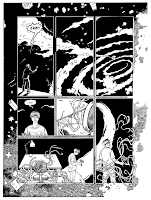
I'm trying to represent music visually in this next sequence and it's proving rather difficult. I had a look at the Bach Toccata & Fugue in D Minor segment of Disney's Fantasia again to see if that would inspire me, but no such luck. So I drew this based on an old sketch from a couple years ago and it seems to be closer to what I wanted. Whether or not it accurately represents sound is another matter. At least it looks nice. :p
The biggest problem is I'm trying to draw this as black & white lineart, but to be a better representation of synesthesia, it would work much better in colour. I think I'll do a black & white and a coloured version and decide later which one to use.
Sunday, April 25, 2010
Page 26
(Next - pages 27, 28 & 29)
(Previous - pages 24 & 25)
What, you've never found subliminal messages in your cereal before? ;p
This is the end of chapter 1, by the way...it might be quite a while before I add any new pages. Still working the kinks out of chapter 2's (partial) script. I PROMISE you I will do it though, no matter how long it takes. I'll post some more sketches later on to prove I'm still working.
Here's the revised splash page that I forgot to upload earlier.
Monday, April 19, 2010
Pages 24 & 25
(Next - page 26)
(Previous - pages 22 & 23)
More dry brushing. That's Jeremy's friend Keith smooching Erin. Because apparently it wasn't enough to show Jeremy frozen AND impaled on tree branches. (???) JEEZ, Elaine. D: (This is still the dream sequence, of course)
From this page we can also deduce that Keith probably plays hockey and smokes a lot of weed.
I just ordered some new brushes, because all of mine are pretty much shot. I've read that it's normal for a brush to only last about 20 comic pages, which is kind of depressing considering how expensive they are. Oh well. :p
However, I did order the cheaper W&N "Sceptre Gold II" sable/synthetic blend brushes. I must be the only person on earth who prefers these to the ridiculously overpriced Kolinsky Series 7 sables. I find the Kolinsky much too stiff, with too much of a point on it. I'm sure I'm boring you to tears talking endlessly about brushes, so I'll end this here... :p
Saturday, April 17, 2010
SHINY SHINY
Handed in my project yesterday! :D And here's the finished, printed book...or at least a proof copy. No, it doesn't have my name on the cover...I hope I don't lose marks for that... :p
See how shiny it is!!
I'm hoping to order a small print run in time for the year-end illustration exhibition. GO AUCB, WE'RE THE BEST!!! I'll sell whatever is leftover from that at 8th St. Comics back home. Watch this space!
And just to prove to myself that I AM going to continue this thing...
The beginnings of issue 2, for real! OH JOY!!! :D
OH how I hate drawing cars...I suppose if I drew them more often I wouldn't have so much trouble? :p
Wednesday, April 14, 2010
What do I want from comics?
I've already talked about some of my comic-based influences and how they've affected my own comics. I'll close off this series by talking about the last comic I drew before this one and the type of comic I'd like to make someday.
Comics can be used to tell any type of story, in any genre, with any art style, but ideally I think that they should at least try to make some use of their form as it connects with the story. I'm talking about things that can only be accomplished with comics. "Huh?" you say. I'll try to explain. One comic I tragically haven't read but have been DYING to read for years is Nick Abadzis' Hugo Tate. (Abadzis also drew the award-winning Laika, the true story of the first dog in space). The story of Hugo Tate follows a character who starts out drawn as a stick figure, and gradually becomes more realistically drawn as the story progresses and his character arc develops.
Another comic I haven't read that supposedly makes use of other formalist techniques is David Mazzucchelli's Asterios Polyp. I've got a copy waiting for me in my file at the comic store when I get home...four months from now...sigh.
The very best example of this I HAVE seen is Dylan Horrocks' Hicksville. This tells the story of a fictional town in New Zealand where everyone reads comics, which also houses an underground library of comics that were never drawn - by real-life creators who "never got the chance to tell that magnum opus." The story contains several comics-within-a-comic, mimicking a wide range of styles - Golden Age superheroes (vs. modern-day superheroes), surreal underground comics, mini-comic gag pages, and so on. The superhero spoofs are particularly important as the main storyline concerns a character called Dick Burger, a former resident of Hicksville who moves to America and makes a fortune from a superhero franchise, which he has stolen from another creator's work. Maybe Hicksville wouldn't appeal to someone who isn't a huge comics nerd like me, I don't know. (There are plenty of comics-centric in-jokes - the town's local cafe is called The Rarebit Fiend, for example. And be sure to watch for Stan Lee's cameo!) I still highly recommend it because, like Bryan Talbot's One Bad Rat, it doesn't get the attention it deserves.
Other ideas I've seen include sculpting word balloons so that they become a part of the artwork and environment - weaving around objects, invading a character's personal space, and so on. I've decided to do similar things later on in my comic, such as having several unreadable thought balloons piled on top of each other to demonstrate the rapid thought processes of a manic person.
The page layouts also effect the story - I remember writing about this in my essay, how comic pages usually follow a straight grid and innovative frames are only used for dramatic situations or to create a disorientating effect. I tried this back on pages 3 & 4 especially, and a little bit on pages 22 & 23 below.
Phew...I hope all of that made sense. Let's take a break now to watch Printheads.
...Yeah. Basically it was a story about these two British neo-pagan hoboes (one's a wizard, one's a librarian) that drive around England in an old 1970s Ford Cortina (yes, because you REALLY see a lot of those on the road) fighting demons. And...no, that's all. Not very original. (The guy in the back seat there is basically Shaggy from Scooby Doo if he was obsessed with aliens.) I did make the mistake of giving the basic concept to someone else to write a script from, and we disagreed on how it should play out. I don't think it would have been much better if I'd written it myself, but never mind. Like all the others, it was good practice drawing comics, and I've moved on.
...Then again, I drew this 24 Hour Comic version of the same story which featured an evil Russian librarian turning into a giant potato monster (who is defeated by a bottle of malt vinegar) so...maybe I SHOULD have written it myself and made it as ridiculous as possible, thereby having as much fun as possible. (Why all the librarians? There was some sort of underlying book theme, about certain books being portals to hell - ALSO not very original - and a villain called "Spill Fector" who was a 1000+ year old demon trying to rewrite the entire world to fit his own unique vision. SOME of this stuff has potential but I just never figured out how to make it work)
Most of what I learned while drawing Printheads was dry technical stuff - perspective, proportions, composition, that kind of thing. I'm more careful with how I compose my frames now because I noticed there was often too much "dead" space in the Printheads panels. It's also much easier for me to find the correct horizon line when I start to draw a perspective grid - it sometimes used to take me three tries to get it right and now I can nail it the first time every time. Finally, I now use a brush to ink the characters and most other foreground elements, as it's much faster than using fineliners for everything.
So where does this leave me today? After finishing Look Straight Ahead (and believe me, I'm GOING to finish it - it is my DUTY), what kind of comic would I like to create in the future?
As evidenced by Printheads, I'd just really really like to tell some sort of swashbuckling adventure story. This story should be original, entertaining, and fun - there should also be a good amount of humour. Hmmm. Shall we look to cinema for inspiration again?
Oh! A Chinese Ghost Story, of course! This has everything you could ever want from a film: adventure, romance, a good dose of humour, scary bits, great visuals and plenty of action. Although I guess I'm thinking of targeting a slightly younger audience with my hypothetical adventure story. My mother has also been after me to draw a children's book for years, but I just haven't come up with a good idea for one yet.
What other comics would I like to draw? I definitely also want to draw something surreal, dark and creepy, with a very angular art style. (In fact, about a year ago I DID start drawing a comic called "Hornet's Heart" about an evil man who murders his wife and tries to make it look like an accident - the reason being that she wants a divorce and he doesn't want her to get half of his possessions. Of course he gets his comeuppance - his wife comes back as a giant hornet and kills him. The only reason I didn't finish drawing this comic is because I can't draw insects to save my life.)
It's tough for me to write these learning logs simply because I've been drawing comics for 8+ years and have learned as I've gone along, through trial and error - and back then, a lot was based on instinct. I'd draw a close-up of a character or a long shot or something, but I wouldn't know WHY - now I know that a character's face should be shown if it's important to show their emotions, and a long establishing shot is for showing the surrounding environment and grounding the reader in a setting. This all sounds very obvious now, and I'm trying to work out things that aren't quite so obvious. Such as...how can I REALLY make page designs work to my advantage, and perhaps make certain pages works of conceptual art in themselves? How much can I get out of just black & white? How can I make GOOD use of negative space? For example, could I have just ONE small panel in the center of a page, as Craig Thompson sometimes does? How many panels per page is too many? (Hey - deliberately overloading a page with panels could serve the same purpose as piling thought balloons on top of each other - to show a character is deeply confused and frightened. HEY!)
I think that's about all I have to say. My project deadline is tomorrow (the 16th) so unless I think of something between now and then...later!
Tuesday, April 13, 2010
Pages 22 & 23
(Next - pages 24 & 25)
(Previous - pages 19, 20 & 21)
I tried some new things on these pages, namely dry brushing and extreme foreshortening - well, maybe "new" isn't the right word - I practice foreshortening sketches almost every time I sit down to sketch, you just never get to see any of them because they aren't very good. :p I don't know how the dry brushing is going to turn out in the printed version, but it seems to have scanned all right, so I'm not concerned.
I'm going to start drawing the second chapter of the story within the next few days. Also I suppose I'd better write up another one of those learning log posts soon-ish.
Tuesday, April 6, 2010
Subscribe to:
Posts (Atom)